Two years ago, a team of engineers and designers on Google's Gmail team decided that Gmail wasn't cutting it.
Google's signature email program first hit the Web in 2004. In its earliest days, it was a godsend to everyone who battled against a daily rush of messages.
But email has once again become too onerous. There's too much mail and it performs too many functions in our lives. Email is a place for correspondence, for status alerts from social networks and online stores and airlines, and a file system for transferring and storing important documents. For many people it's also a to-do list and quasi-calendar, the central planner and task manager for your day. And though it is tremendously useful and will never die, email is also, for many people, completely annoying.
So the Gmail team decided to rethink email. "We decided, 'What if we cleared our minds, started fresh, and built something new to help people get back to what mattered to them?'" said Alex Gawley, Gmail's product director, in an interview at Google's headquarters. "What if we did more of the work for them?"
The program that Mr. Gawley and his team have come up with is Inbox, and Google on Wednesday plans to release a version for Android, iOS devices and the web on an invitation-only basis. Inbox isn't an upgrade to Gmail. It's a long-term replacement for it. Though Gmail isn't going anywhere - Inbox's creators stressed that they love Gmail and that Google plans to keep working on it - Inbox is meant to be your email system for the next decade. You'll sign into Inbox with your Gmail account and you'll see all your old messages there, and much of what you do in Inbox will be reflected in Gmail. But Google expects most people to use Inbox or Gmail, not both. In fact, both Mr. Gawley and Jason Cornwell, Gmail's lead designer, say they get their mail through Inbox, not Gmail.
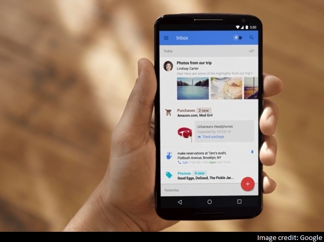
Google's Inbox replaces email's familiar main screen with more thoughtfully designed previews of messages that share the overall aesthetic of a social-networking feed.Credit
Google showed me an in-depth demo of Inbox, but I wasn't given a chance to use it on my own email. What I saw of it looked interesting. Inbox replaces email's familiar main screen - a list of subject lines and senders - with more thoughtfully designed previews of messages that share the overall aesthetic of a social-networking feed. When your friend sends you some photos, you see the pictures right on the main screen, and you can flip through and dismiss them without going into the message.
The iOS version of Google's new Inbox app, which integrates social and to-do list functionality with email. Credit Inbox also relies on Google's data-mining prowess to improve these highlights. For instance, instead of showing you a message from your airline about your flight, it shows you real-time information about that flight gathered from the web. When you click on the highlight, you can always see the underlying message, but if the software does its job well, you won't have to click on the message.
Finally, Inbox functions as a to-do list. You can create tasks and reminders that appear in your inbox alongside your messages. The tasks are super smart, pulling in relevant data to make them useful. If you type "call my dentist," it might populate the task with your dentist's phone number and only her office hours.
Some of these features aren't completely novel. Inbox requires a series of gestures to navigate and sort your messages, a system that feels similar to that of Mailbox, an email start-up that was bought by Dropbox. (Box names are popular in Silicon Valley.) It also automatically categorizes some of your email in a way that Gmail and Outlook already do.
Overall, though, there's enough that's new in Inbox that I'm eager to give it a long-term whirl. I'll report back if it improves how I deal with my messages, or if it's just another gloss on a eternal tech problem.
© 2014, The New York Times News Service
0 comments:
Post a Comment